My bedroom felt flat the week before Valentine’s. I wanted a retreat that felt warm and a little romantic without going overboard on reds and hearts. I spent about $220 on textiles and lighting and got a space that now reads intentional and calm. One misstep I’ll admit: I first bought shiny silk curtains. They reflected light oddly and read formal, so I swapped them for linen-look panels and the whole room relaxed.
Quick context: This is a modern romantic look with a soft, neutral base and blush accents. Budget: $200–$400 if you’re refreshing a room; $100–200 to add a few key pieces. Works best in bedrooms or a small living room nook. Right now, people are searching for natural textures plus subtle pinks—soft layers, not bright Valentine reds.
What You'll Need for This Look
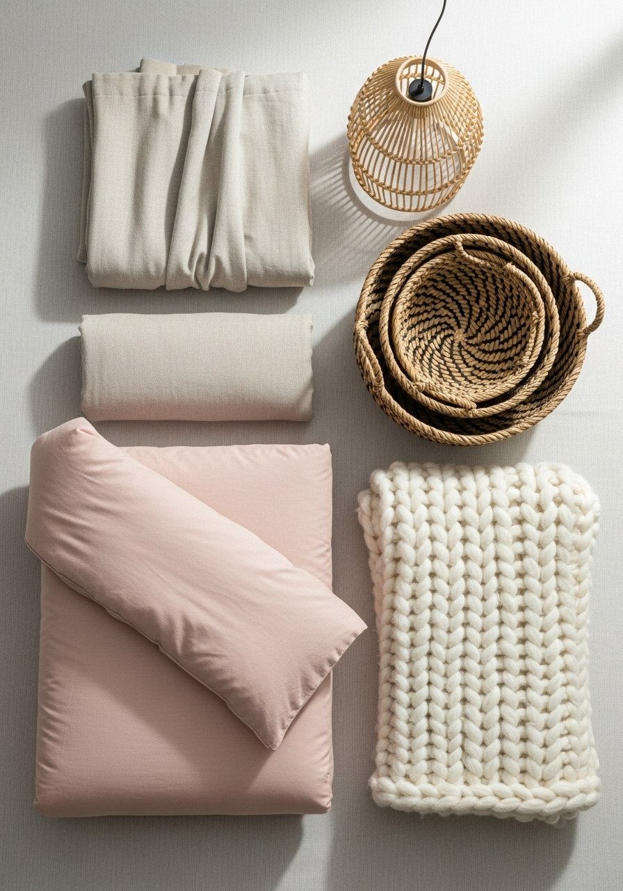
Foundation pieces:
- 8×10 jute area rug in natural (~$120-180)
- Linen curtains in white, 96-inch length (~$35-50 per panel, need 2-4 panels)
Textiles & layers:
- Chunky cable knit throw in oatmeal (~$40-60)
- Linen duvet cover in blush pink, queen (~$70-110)
- Euro pillow inserts, 26×26, set of 2 (~$35-50)
Lighting:
- Rattan pendant light, 15-inch diameter (~$60-90)
- Table lamp with linen shade (~$45-70)
Finishing touches:
- Artificial olive tree in cement pot, 4-5 feet (~$70-110)
- Woven storage baskets, set of 3 (~$35-55)
Budget-friendly swaps:
- Swap real linen for linen-look blend curtains to save roughly half.
Start with the foundation: rug and curtains
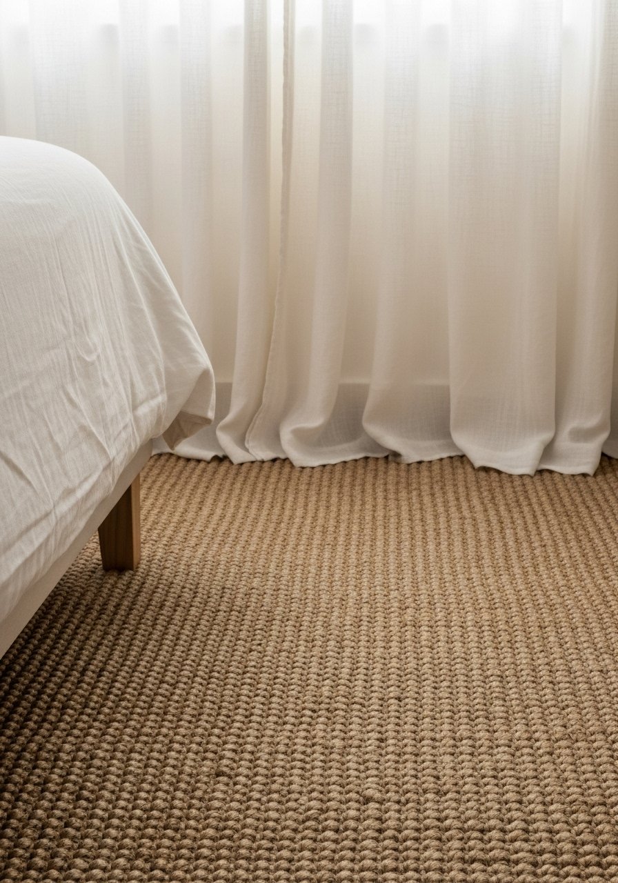
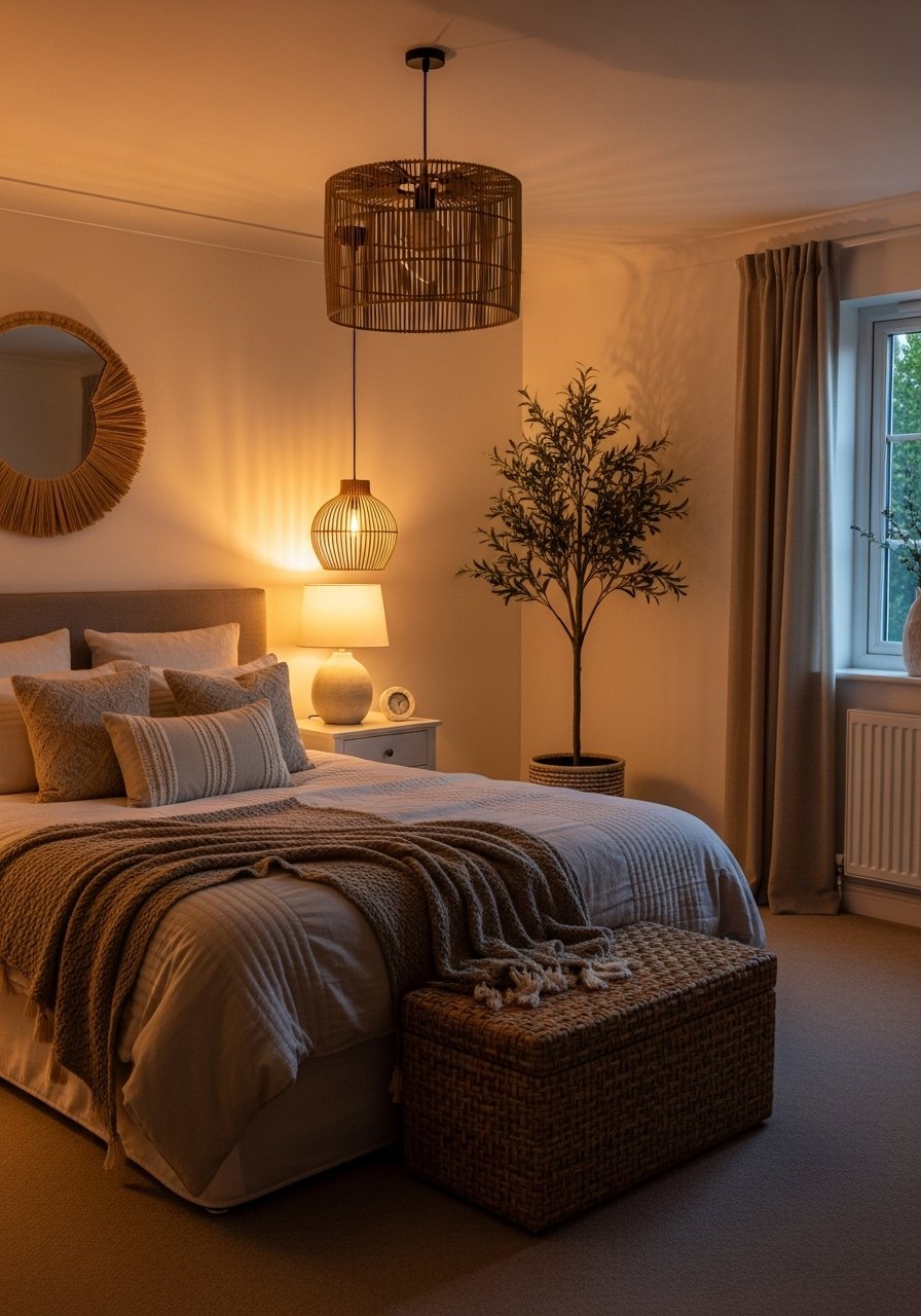
The rug and curtains set the stage. I used an 8×10 jute rug so the bed and nightstand front legs sit on it. That anchors furniture and prevents the “floating” look. For curtains, I hung white 96-inch linen panels 2–4 inches from the ceiling. The vertical line makes the ceiling feel taller and the room airier.
Visual principle: proportion and scale. A larger rug enlarges the perceived floor plane. Taller curtains lengthen the wall. Mistake people make here: picking a rug too small. It fragments the floor and weakens the composition. If you have an 8×10 room, go 8×10 rug rather than a 5×8.
Layer in softness with oversized textiles for a calm, romantic feel
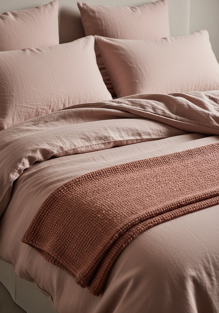
Bedding is where the Valentine mood appears without kitsch. I used a blush linen duvet cover, queen as the color anchor. On top, I layered euro pillows 26×26 in a soft neutral and draped a chunky oatmeal throw at the foot. The large-form pillows add structure. The knit throw adds texture and tactile contrast against the linen.
Visual principle: texture contrast and scale. Large pillows create a backdrop. Smaller accent pillows or a lumbar keep the layout balanced: aim for the back layer (Euros) to be about one-third the bed’s width in height. My failed choice: I tried three patterned pillows in different scales. It looked busy. I removed patterns and stuck to texture and one blush tone.
Create ambiance with warm, diffused lighting and natural accents
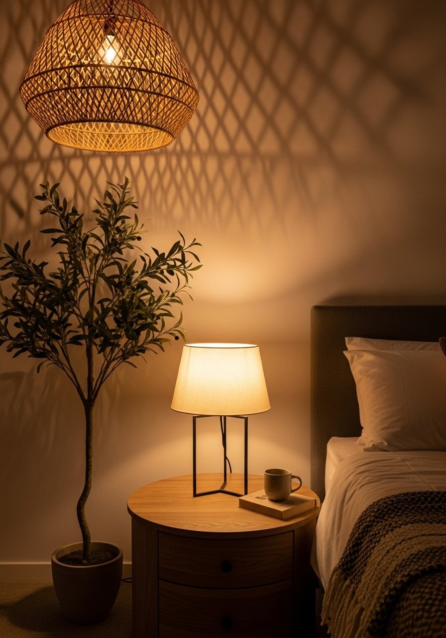
Lighting completes the mood. I chose a rattan pendant, 15-inch for soft overhead texture and a table lamp with linen shade at the bedside for reading and mood. Use warm bulbs (around 2700K) for flattering skin tones and a relaxed feel. Layer light: overhead for general, lamp for task, and a subtle string or candle light for romance.
Visual principle: layering light and rhythm. Mix heights and light sources so the eye moves around the room. Add a live-looking artificial olive tree in a cement pot in a corner to bring vertical interest without upkeep.
Common Styling Mistakes to Avoid
Mistake: Using all decor at the same height
Why it doesn't work: It reads flat and static.
Do this instead: Vary heights in odd numbers. Graduated candlesticks set adds instant variation.
Mistake: Hanging curtains at the window frame
Why it doesn't work: It chops the wall and shortens ceilings.
Do this instead: Mount the rod near the ceiling. Adjustable curtain rods fit most windows.
Mistake: Buying a rug that’s too small
Why it doesn't work: Furniture looks disconnected.
Do this instead: Choose an 8×10 area rug for a bed in most standard rooms.
Shopping Guide: Where to Find These Items
- Budget textiles on Amazon: Get the look for less with linen-blend duvet covers under $50.
- Splurge wisely on the rug: Hand-woven jute 8×10 pays off over years.
- Faux plants that look real: If light is low, try a realistic artificial fiddle leaf fig or the olive tree above.
- For current wood tones: white oak accents read fresh. Try white oak floating shelves for a small display.
Start with one change: I began with the rug and curtains. That single swap made the room feel larger and calmer. Then I added the blush duvet and a chunky throw later. Which element will you change first? If it’s the throw, I recommend this chunky cable knit throw in oatmeal.

